Creator+ allows instructors and course creators to build
engaging and interactive learning materials directly in Brightspace, improving
engagement and simplifying grading and reporting. By leveraging existing
workflows with easy-to-use tools, users can build dynamic content and media
experiences that appeal to the love of learning, improve comprehension, and
achieve high engagement for instructors and learners.
Creator+ Elements allows instructors to add dynamic
components with a user-friendly authoring experience that does not require HTML
coding knowledge or experience. This tutorial demonstrates how to build
Creator+ Elements on the Content & Assessments page.
1. Navigate to the Content and Assessments page.
2. Locate the module in which you would like to
create the content.
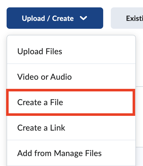
3. Select Upload/Create.
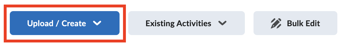
4. Select Create a File.
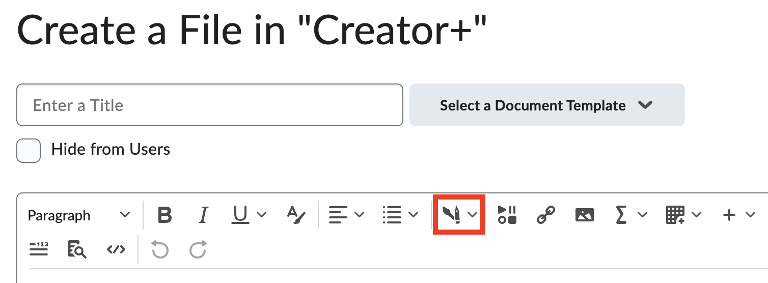
5. In the MyFIRE Editor textbox, select the
Creator+ icon.
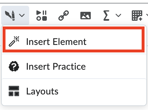
6. Select Insert Element. Then select an option
from the following:
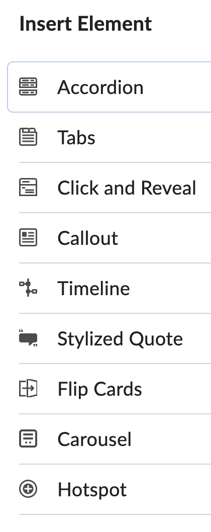
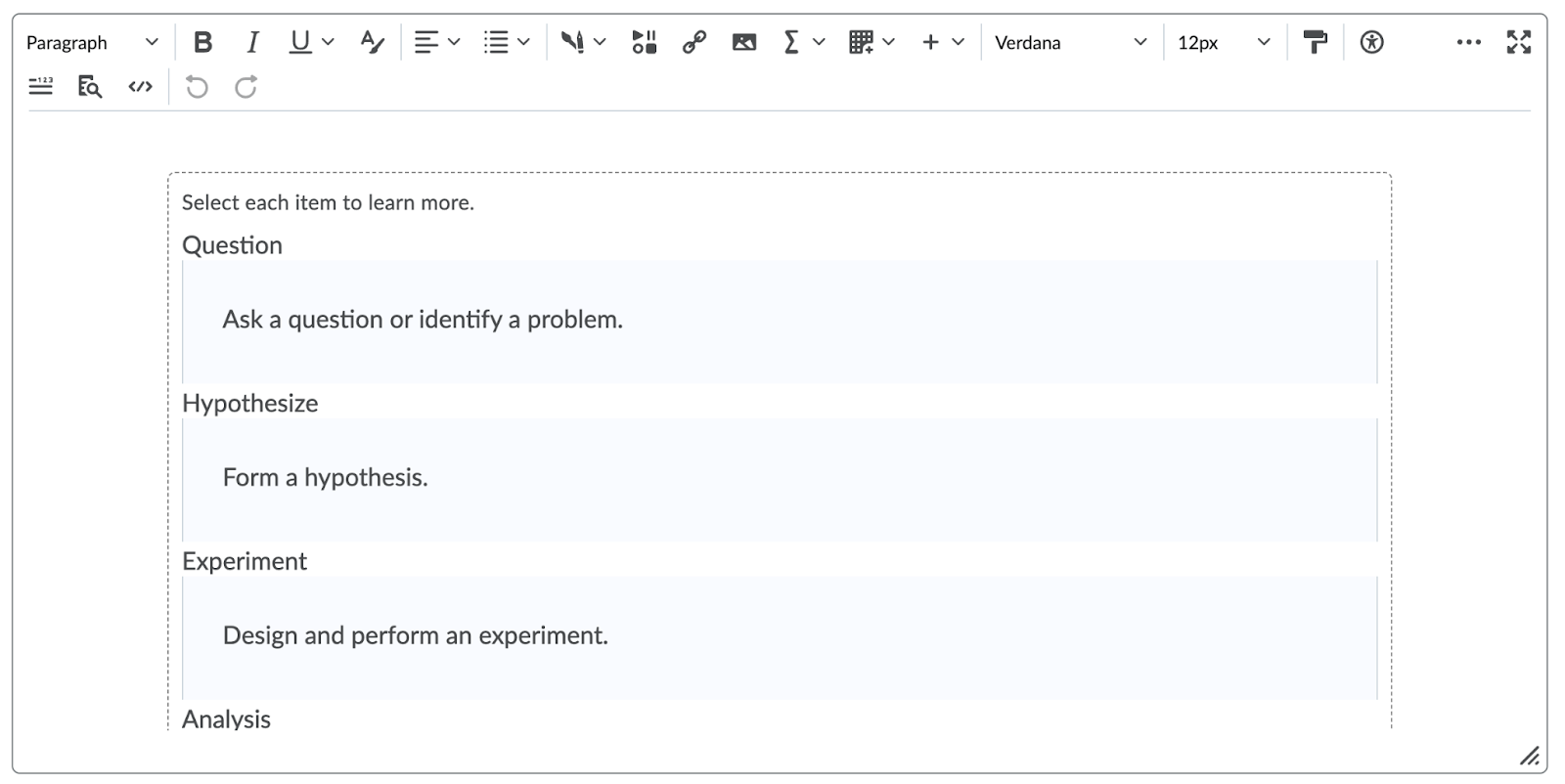
a. Accordion - These are useful when you have a
list of items with additional information to learn about each item. Using an
accordion allows the learner to focus on learning the list first, then
expanding their understanding by opening each accordion tab.
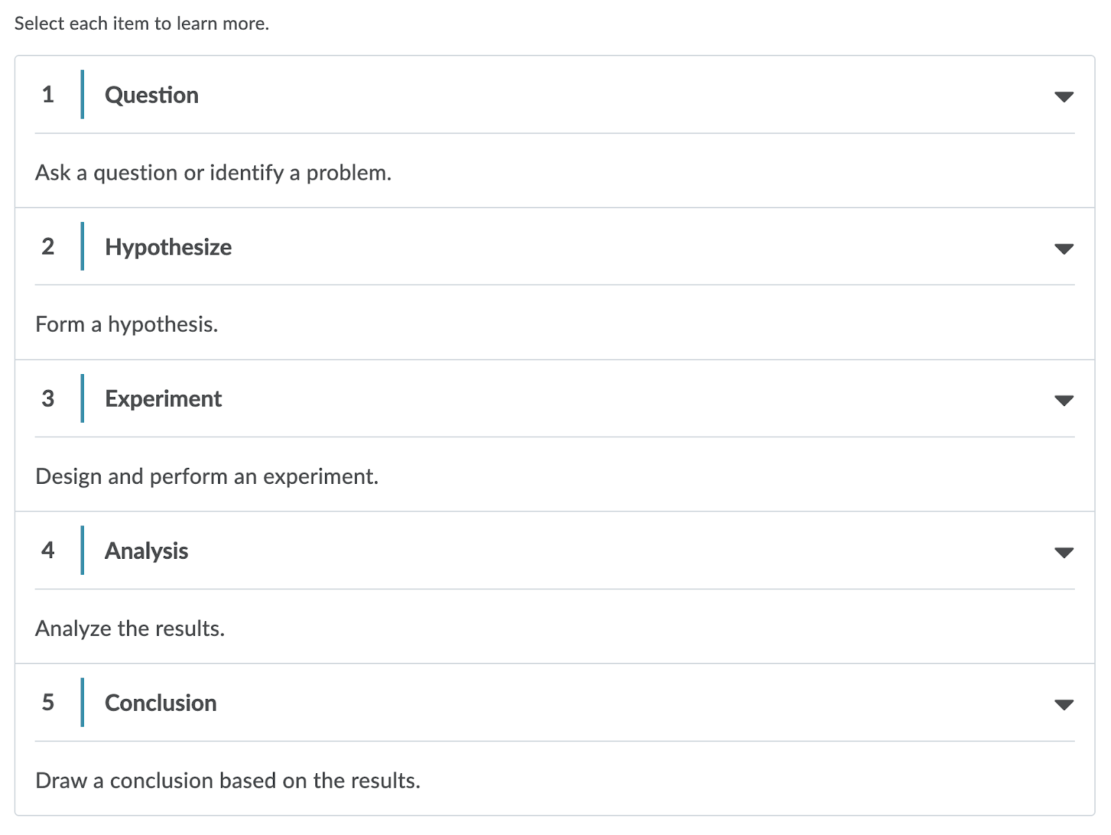
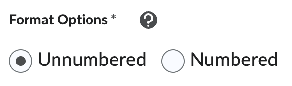
i. Decide if you would like it to be unnumbered or
numbered. Numbered accordions are useful when you need to present learners with
a set number of items in the list. Unnumbered accordions are useful when the
number or order of closely related items is not a point of focus.
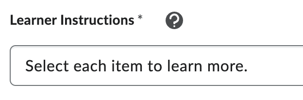
ii. Add Learner Instructions. Learner instructions
appear immediately before a dynamic element to ensure learners know there’s a
selectable element to engage with. Standard learner instructions are
pre-populated.
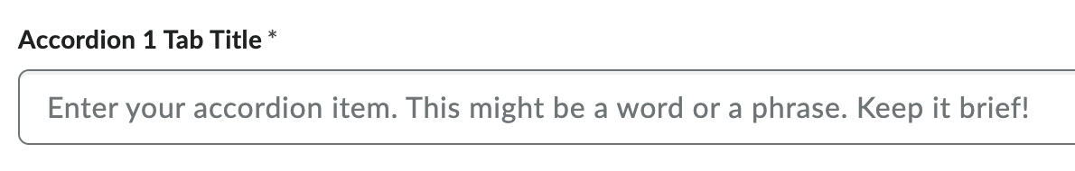
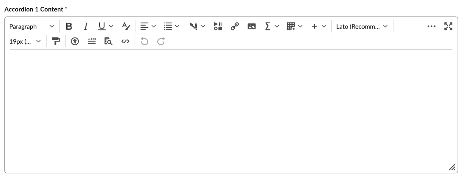
iii. Add a title for each tab.
iv. Add content for each tab.
v. Reorder the Accordion Items by selecting the up
and down arrows.
vi. Select Add Accordion Item if you would like to
add additional tabs.
vii. Delete a tab by selecting the trash can icon to
the right of the tab title.

viii. Select Preview to preview the content before it
is added.
ix. Select Insert.
b. Tabs - These are useful for providing
information that belongs in a series.
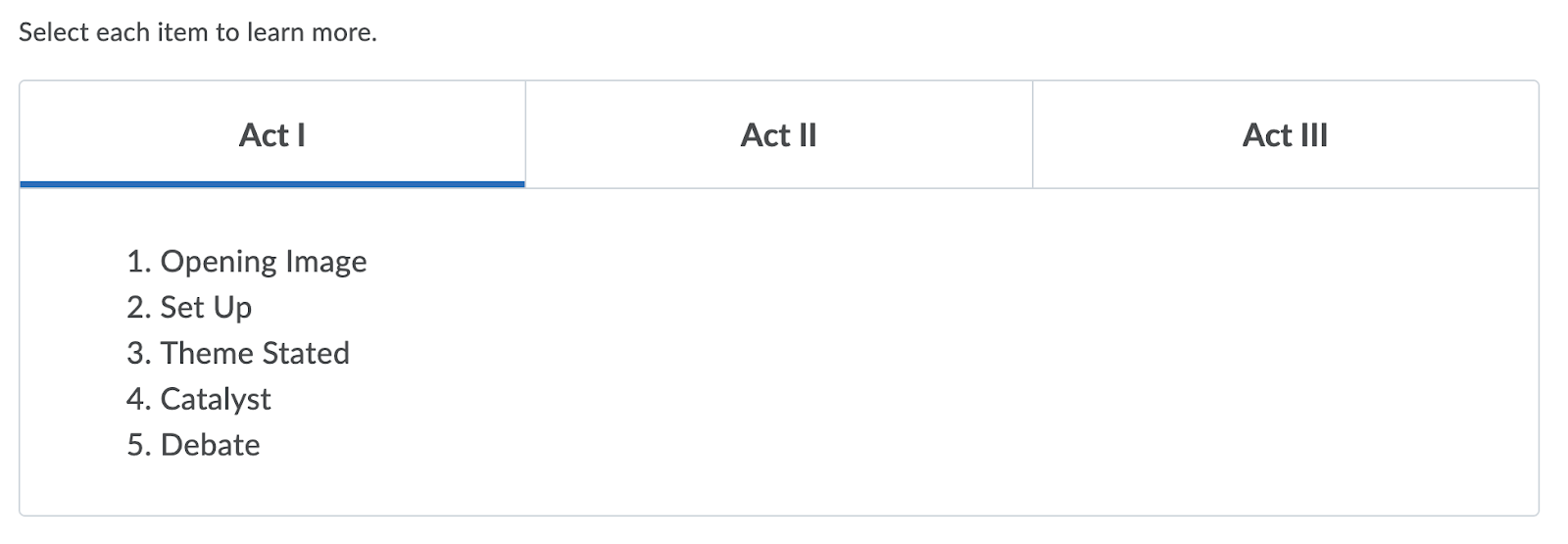
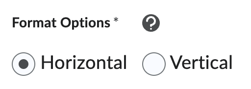
i. Decide if you would like the tabs to be
horizontal or vertical. Horizontal tabs are preferred if you have few tab
labels, but lengthy content under each tab. Choose vertical tabs when you have
a large number of tab labels.
ii. Add Learner Instructions.
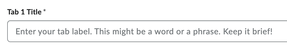
iii. Add a title for each tab.
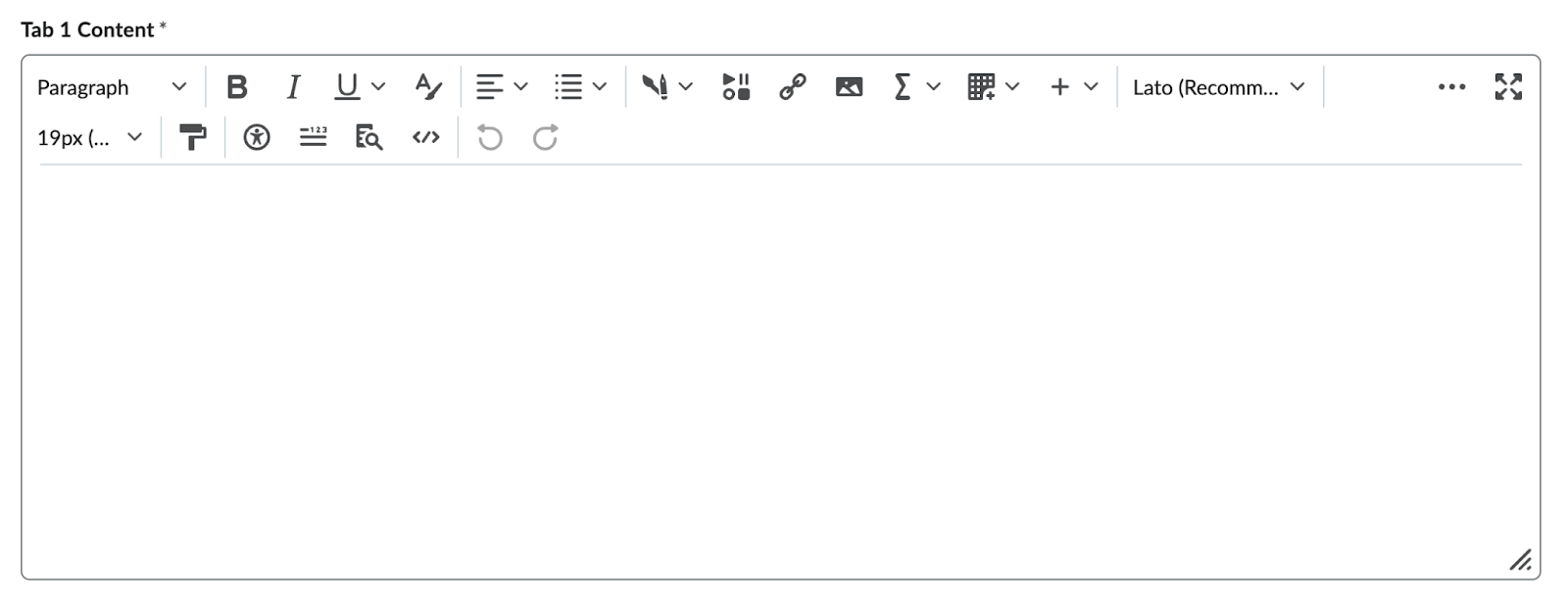
iv. Add content for each tab.
v. If you would like to add an image to a tab,
select Add Image under the tab’s content box.

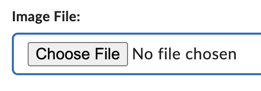
1. Select Choose File to locate the file on your
computer.
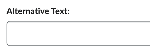
2. Provide alternative text for the image. This
text should convey the same information as the image.
3. If the image does not convey any information,
select the "This image is decorative" checkbox.

vi. Reorder the Tabs by selecting the up and down
arrows.
vii. Select Add Tab Item if you would like to add
additional tabs.
viii. Delete a tab by selecting the trash can icon to
the right of the tab title.
ix. Select Preview to preview the content before it
is added.
x. Select Insert.
c. Click and Reveal - These are useful when you
want to present a learner with a question, statement, or fact to reflect on
before they select a button to reveal the key learning related to the original
statement.
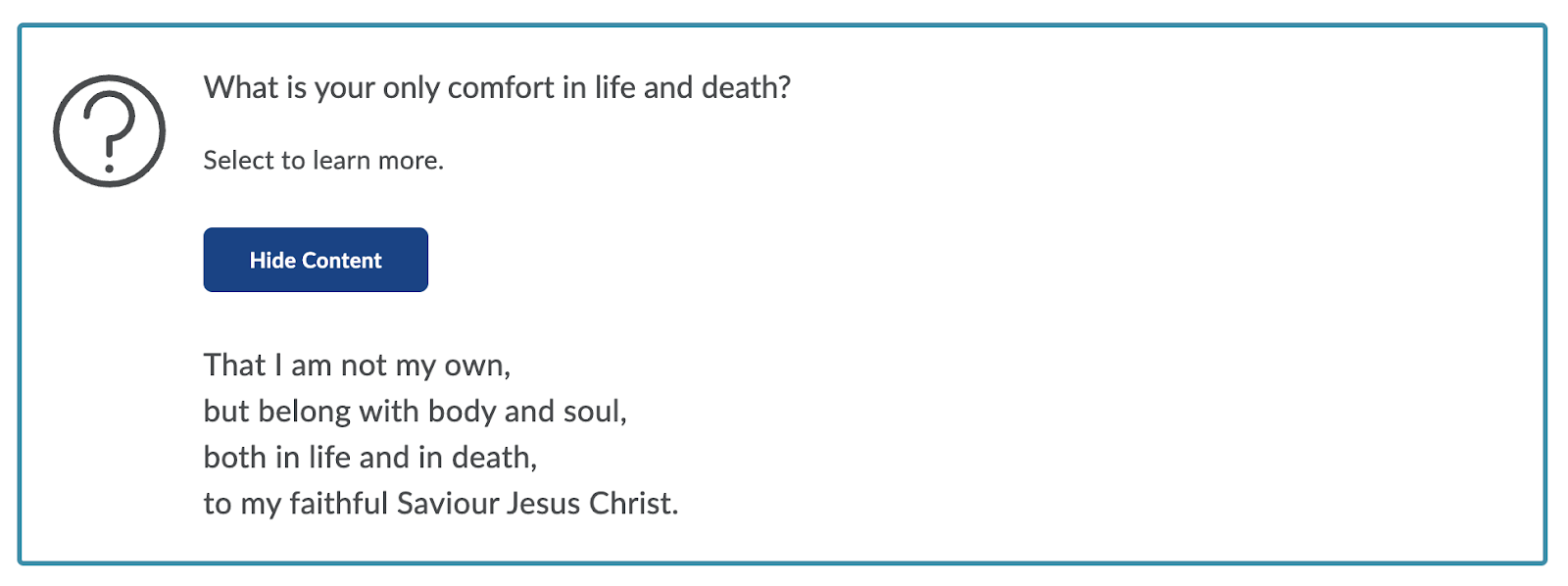
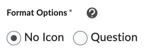
i. Decide if you would like the click and reveal to
include a question mark icon.
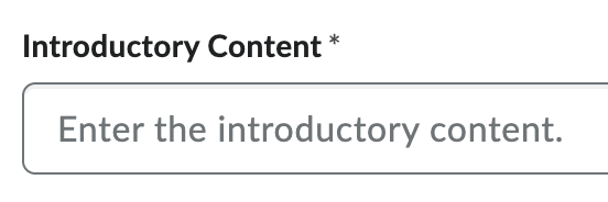
ii. Add Introductory Content.
iii. Add Learner Instructions.
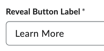
iv. Add text to be written on the Reveal Button
Label.
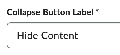
v. Add text to be written on the Collapse Button
Label.
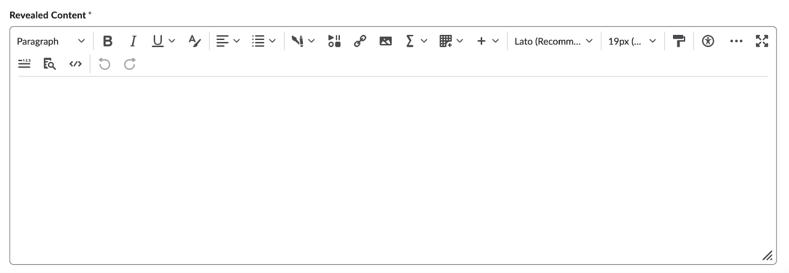
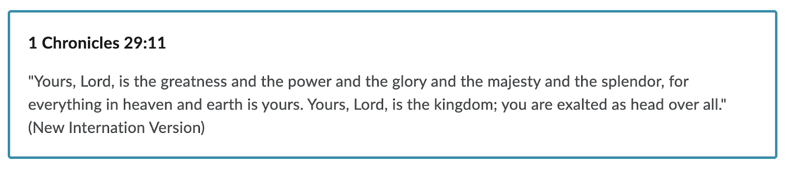
vi. Add Revealed Content.
vii. Select Preview to preview the content before it
is added.
viii. Select Insert.
d. Callout - A callout is a bordered rectangle. It
separates the content within the rectangle from the rest of the content.
Callouts are useful for drawing attention to a key detail or an aside to the
primary content, like a case study, definition, or anecdote.
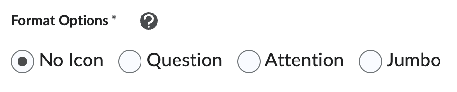
i. Decide if you would like the callout to have no
icon, include a question mark, include an exclamation mark, or be in color by
selecting the corresponding options: No Icon, Question, Attention, or Jumbo.
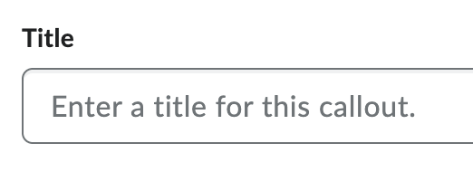
ii. Add a title.
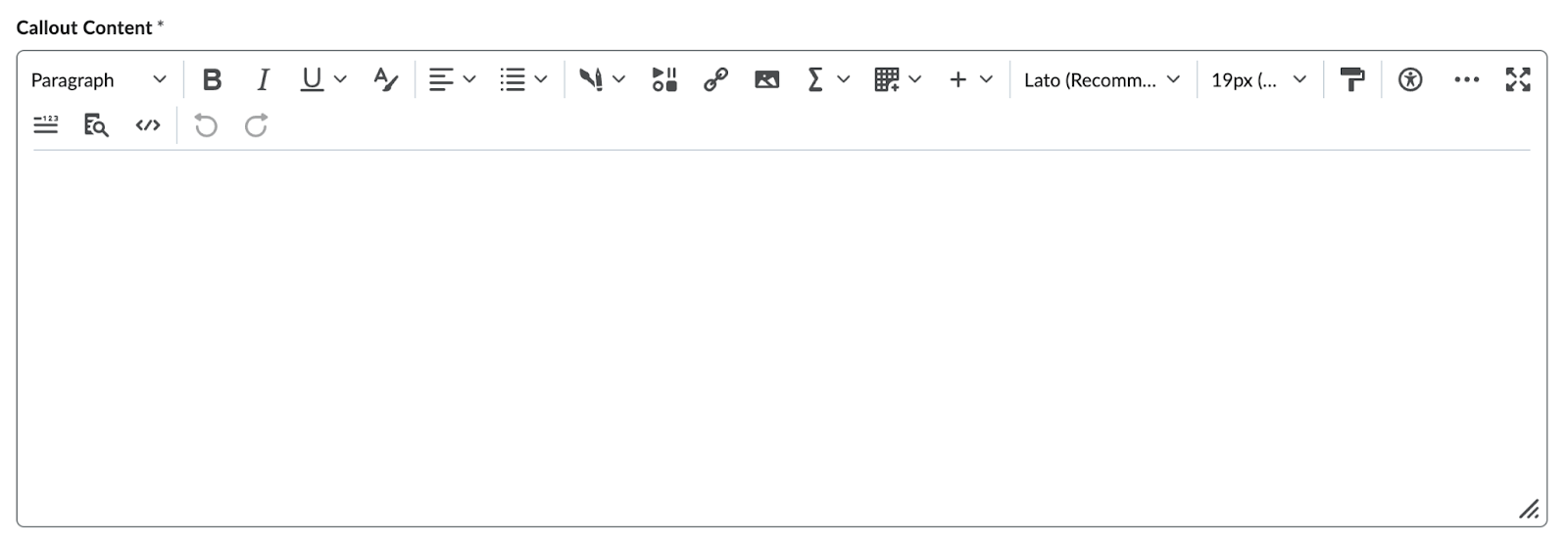
iii. Add the callout content.
iv. Select Preview to preview the content before it
is added.
v. Select Insert.
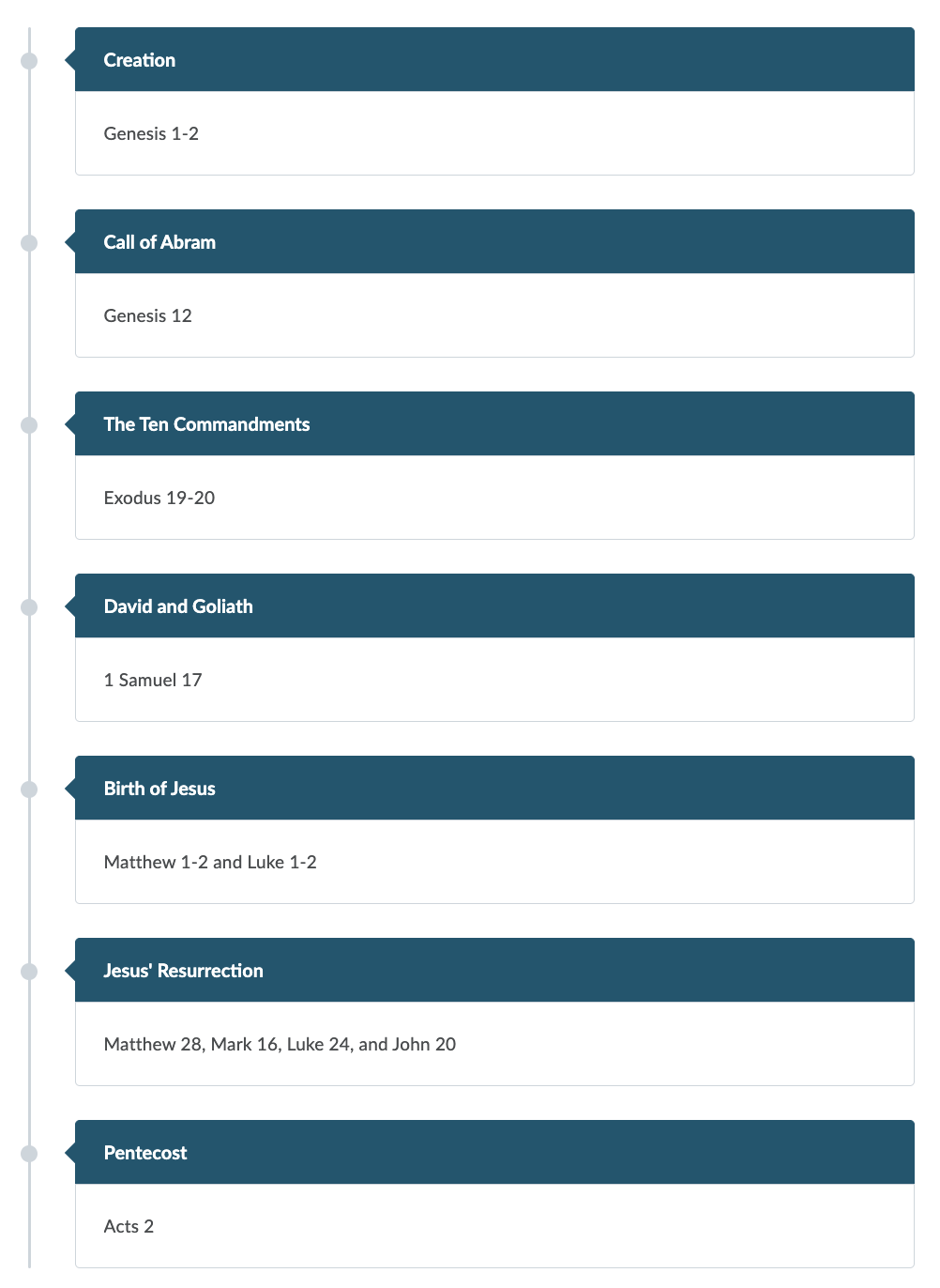
e. Timeline - A timeline is useful for laying out
events over a period of time, the steps in a process, or items in a series. A
timeline can also be useful for demonstrating two sides of a conversation.
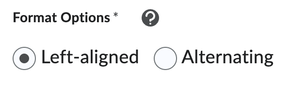
i. Decide if you would like the timeline to be
left-aligned or alternating. When the learner’s screen size is smaller (for
example, on a mobile device) the alternating timeline will convert to
left-aligned layout.
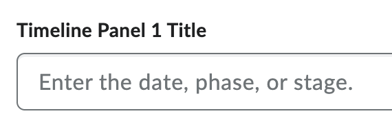
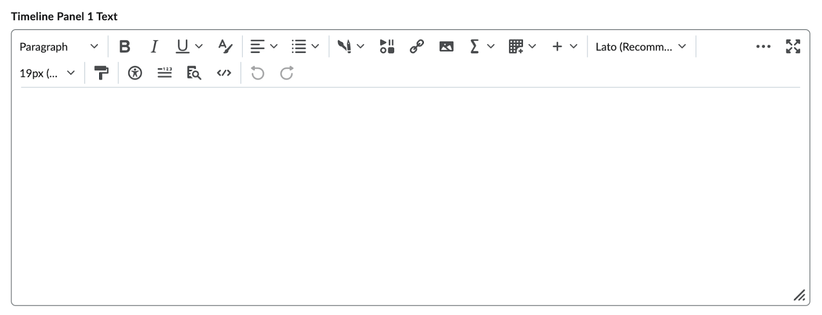
ii. Add a title for each panel.
iii. Add text for each panel.
iv. Reorder the Timeline Panels by selecting the up
and down arrows.
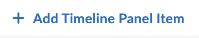
v. Select Add Timeline Panel Item if you would like
to add additional panels.
vi. Delete a panel by selecting the trash can icon
to the right of the panel title.
vii. Select Preview to preview the content before it
is added.
viii. Select Insert.
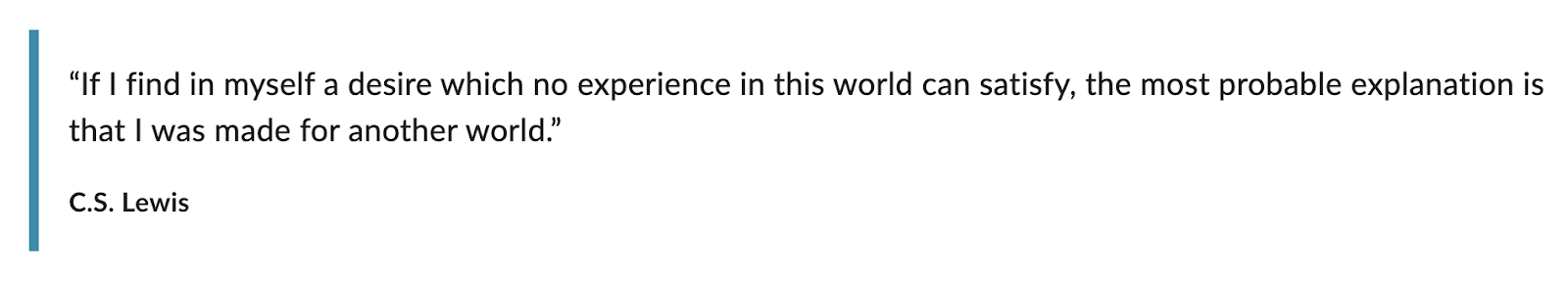
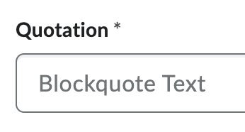
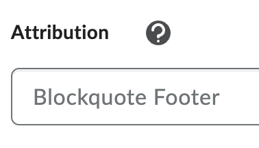
f. Stylized Quote - A stylized quote uses large,
stylized quotation marks and color to set it apart from primary content.
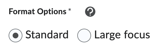
i. Decide if you would like standard format or
large focus.
ii. Add the Quotation.
iii. Add the Attribution.
iv. Select Preview to preview the content before it
is added.
v. Select Insert.
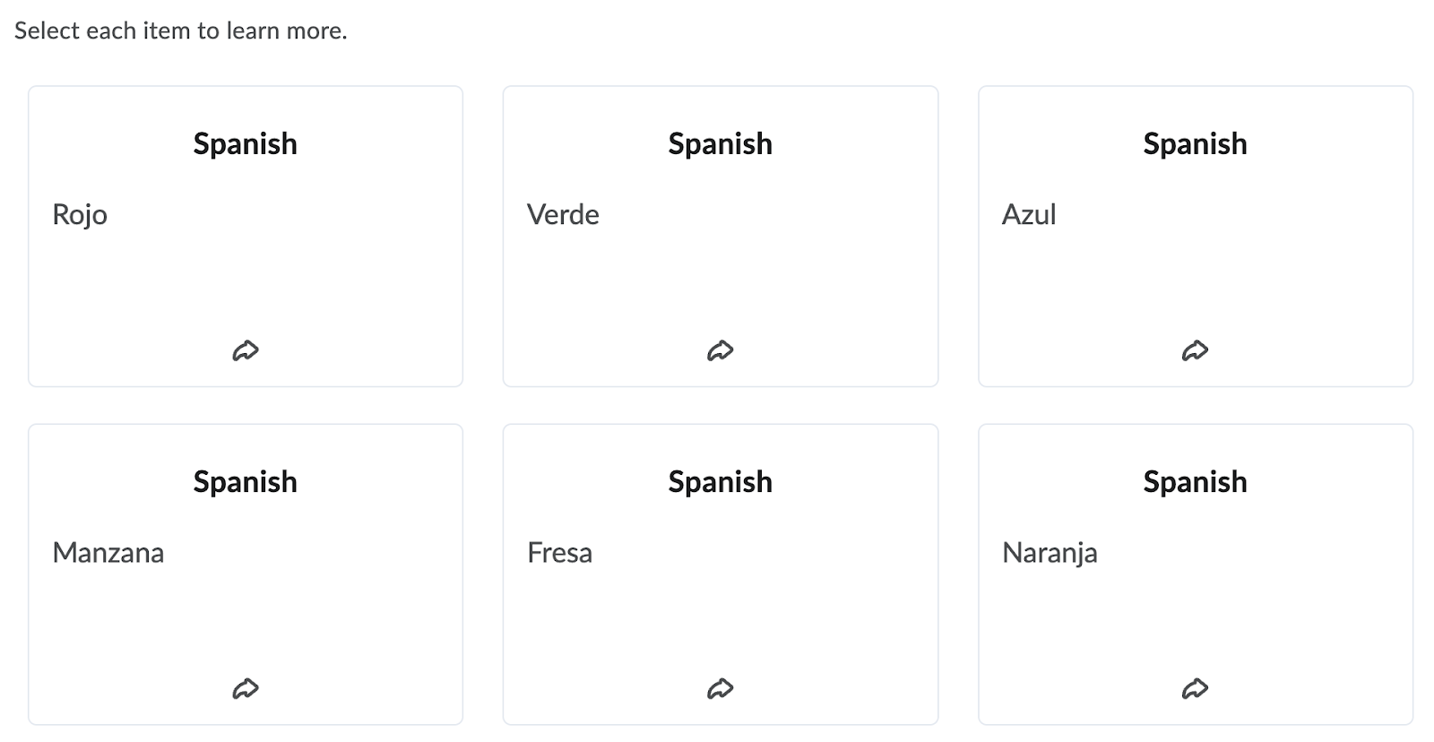
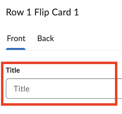
g. Flip Cards - Flip cards are an excellent choice
for displaying a collection of items that don’t necessarily have a strict
structure in their relationship to one another. Flip cards are an especially
engaging choice when you can incorporate images. They are divided into rows.
i. Add Learner Instructions.
ii. Add a title for each card.
iii. Add content for each card.
iv. Select Add Image to add an image to a card.
1. Select Choose File to locate the file on your
computer.
2. Provide alternative text for the image. This
text should convey the same information as the image.
3. If the image does not convey any information,
select the "This image is decorative" checkbox.
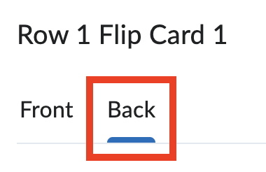
v. Select Back to add a title and content to the
back of each card.
vi. Select Add Flip Card Item to add a card to the
current row.

vii. Select Add Row to add an additional row.

viii. Delete a card by selecting the trash can icon on
each card.
ix. Select Preview to preview the content before it
is added.
x. Select Insert.
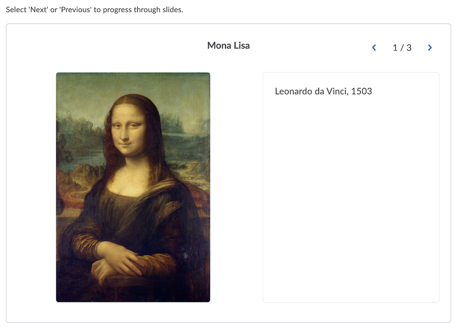
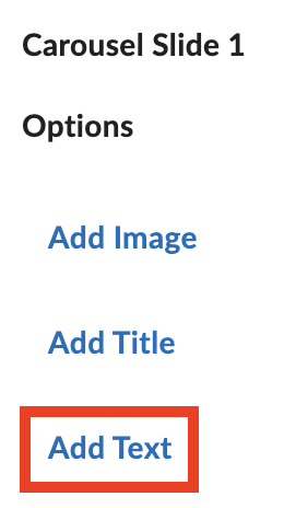
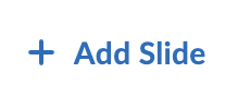
h. Carousel - A carousel is a slideshow of images
and/or text. Carousel slides are displayed one at a time and learners will
click through to access the next slide. Carousels are a great way to showcase
steps in a process or display related items.
i. Add Learner Instructions.
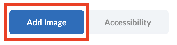
ii. Select Add Image to add an image to a slide.

1. Select Choose File to locate the file on your
computer.
2. Provide alternative text for the image. This
text should convey the same information as the image.
3. If the image does not convey any information,
select the "This image is decorative" checkbox.
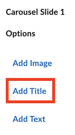
iii. Select Add Title to add a title to a slide.
iv. Select Add Text to add text to a slide.
v. Reorder the slides by selecting the up and down
arrows.
vi. Select Add Slide to add an additional slide.
vii. Delete a slide by selecting the trash can icon
on each slide.
viii. Select Preview to preview the content before it
is added.
ix. Select Insert.
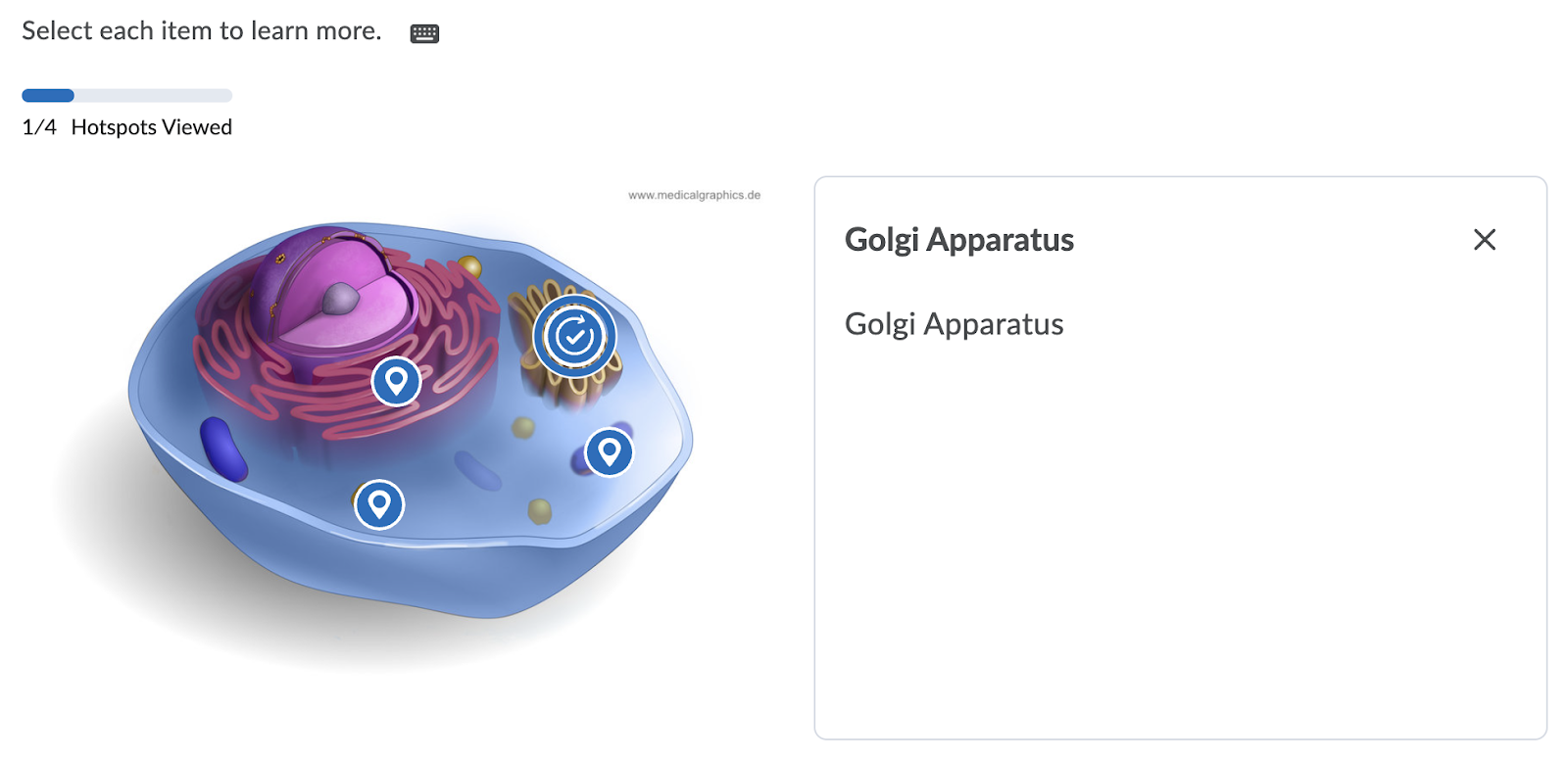
i. Hotspot - Hotspot allows creators to upload an
image and assign selectable “hotspots” that learners can open to learn more.
i. Add Learner Instructions.
ii. Select Add Image to add the image.
1. Select Choose File to locate the file on your
computer.
2. Provide alternative text for the image. This
text should convey the same information as the image.
iii. Select the location on the image where you would
like to add a hotspot.
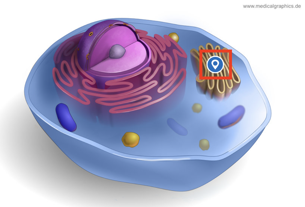
iv. Select the hotspot title to edit the hotspot.

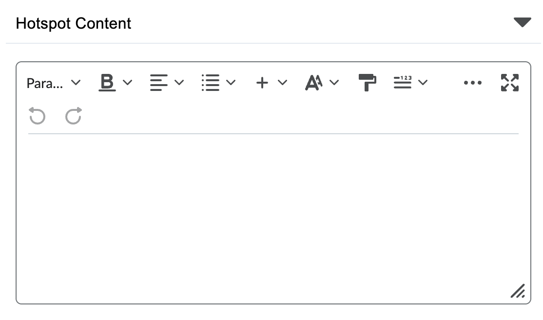
1. Give the hotspot a name.

2. Add content to the hotspot.
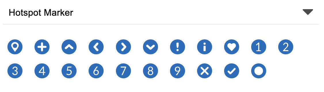
3. Decide which icon the hotspot should have. If
changed, this will need to be selected for each Hotspot added.
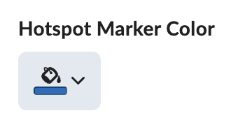
4. Choose the hotspot color. If changed, this will
need to be selected for each Hotspot added.
5. Delete a hotspot by selecting the trashcan icon
at the top of the hotspot information.
v. Select Hotspots to navigate back to the list of
hotspots.

vi. Select Accessibility.
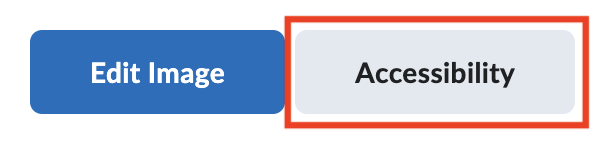
1. Select either Accessible hotspots only or Fully
accessible image.
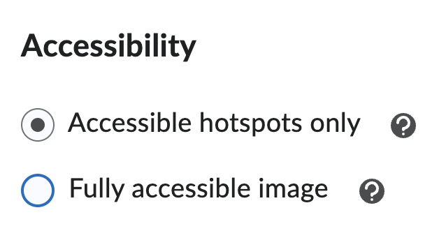
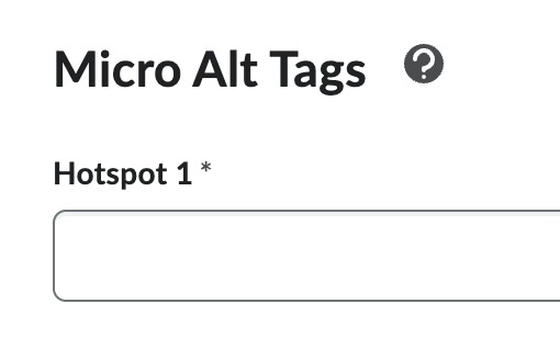
a. Accessible hotspots only - This accessibility
option allows you to provide a micro alt tag for each hotspot. Learners using a
screen reader will hear a description of the full image and can tab back and
forth through hotspots hearing the micro alt tag description of each.
i. Add Mico Alt Tags for each hotspot. A micro alt
tag is an alternative text description for a portion of an image.
b. Fully accessible image - This accessibility
option allows you to overlay your image with a grid that positions each hotspot
into a cell. You provide a micro alt tag for each cell. Learners using a screen
reader can navigate through the grid cell by cell, hearing the description of
each cell as well as its position within the grid giving screen reader users
access to all the details and context of the image.
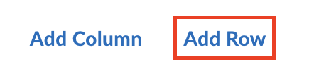
i. Add Micro Alt Tags for each section of the grid.
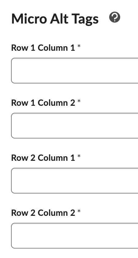
ii. Select Add Column to add an additional column.

iii. Select Add Row to add an additional row.
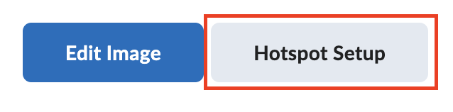
vii. Select Hotspot Setup to navigate back to the
hotspot list.
viii. Select Preview to preview the content before it
is added.
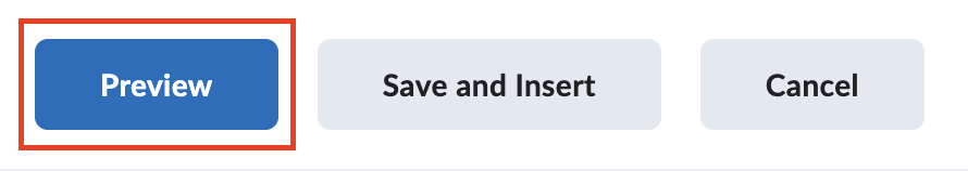
ix. Select Save and Insert.

7. Once you have added an Element, add titles,
descriptions, or more information in the MyFIRE Editor textbox to provide
context for the Element you have added.
Note: The elements will not appear in
the editor textbox exactly as they will appear for students.
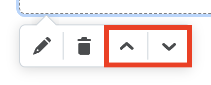
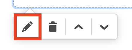
8. Select an Element to access additional options.
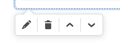
a. Select the pencil icon to edit the Element.
b. Select the trash can icon to delete the Element.

c. Select the up and down arrows to reorder the
content.